an irregular cut solid,
a symbol of solidity, creativity
and ability to innovate.
an irregular cut solid, a symbol of solidity, creativity and ability to innovate.
A new logo and a new payoff capable of conveying Pavesmac’s values at best: a company that acknowledges to achieve much more than just excellent functional surfaces.
In fact, good paving not only supports traffic and activities, but also has an important social and cultural impact.
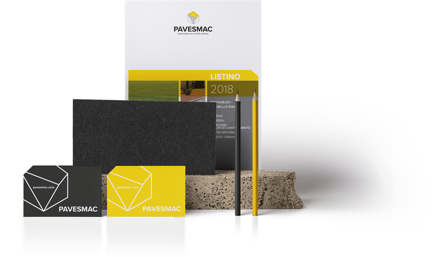
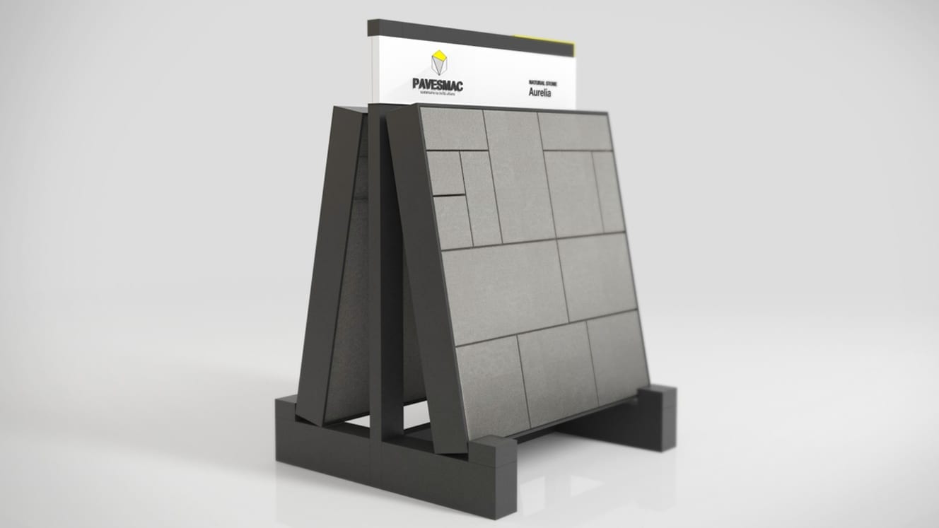
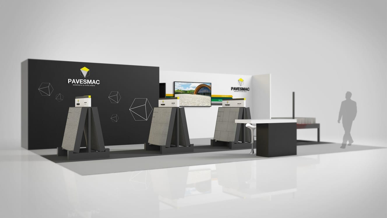
Yellow, black, diagonal lines and cuts.
These are the elements that constitute
the new visual identity of Pavesmac
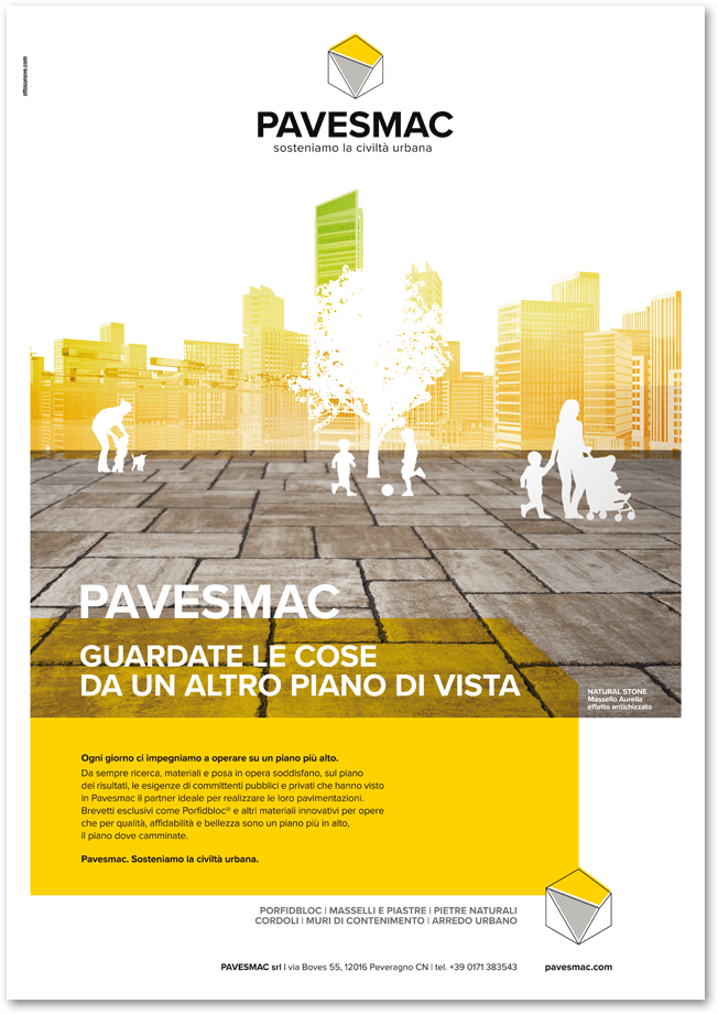
another “plan of view”
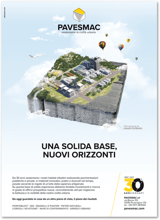
With the new communication strategy, Pavesmac has chosen its ability to innovate and the solidity of a thirty-year long history as its element of unique selling proposition.
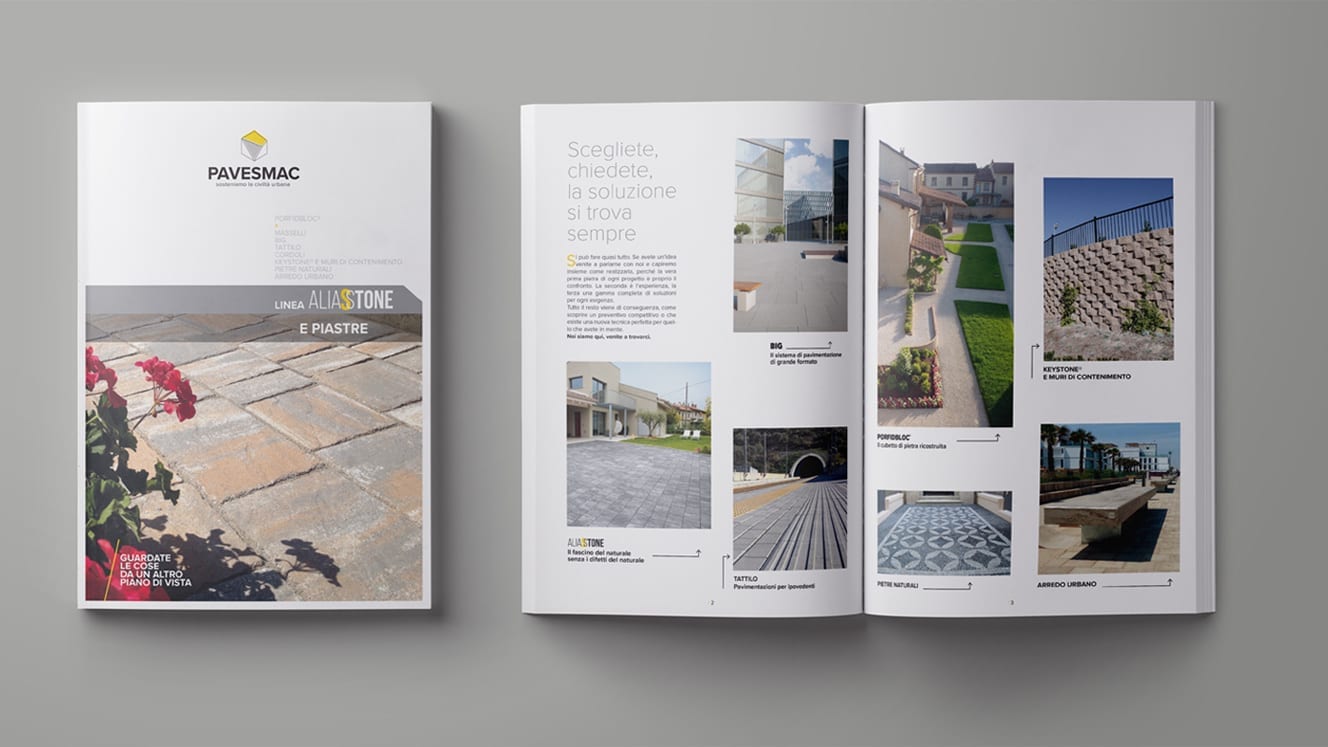
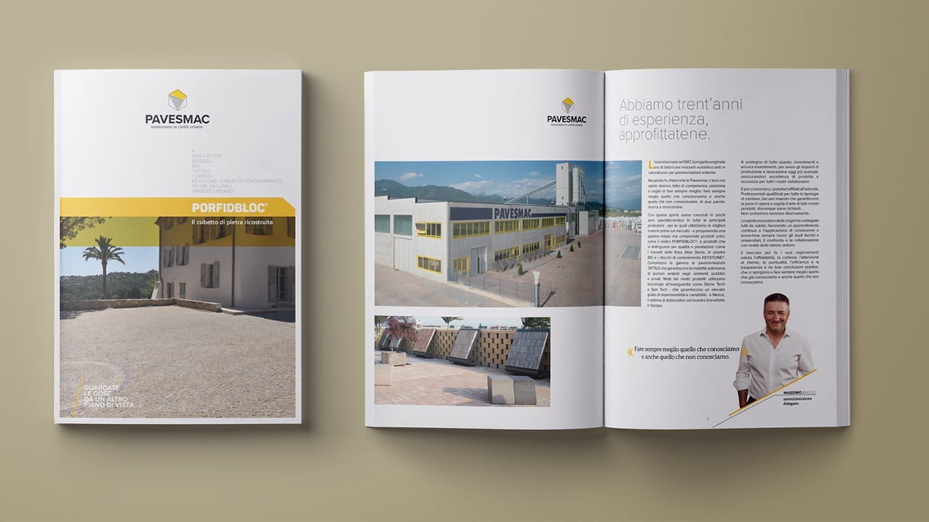
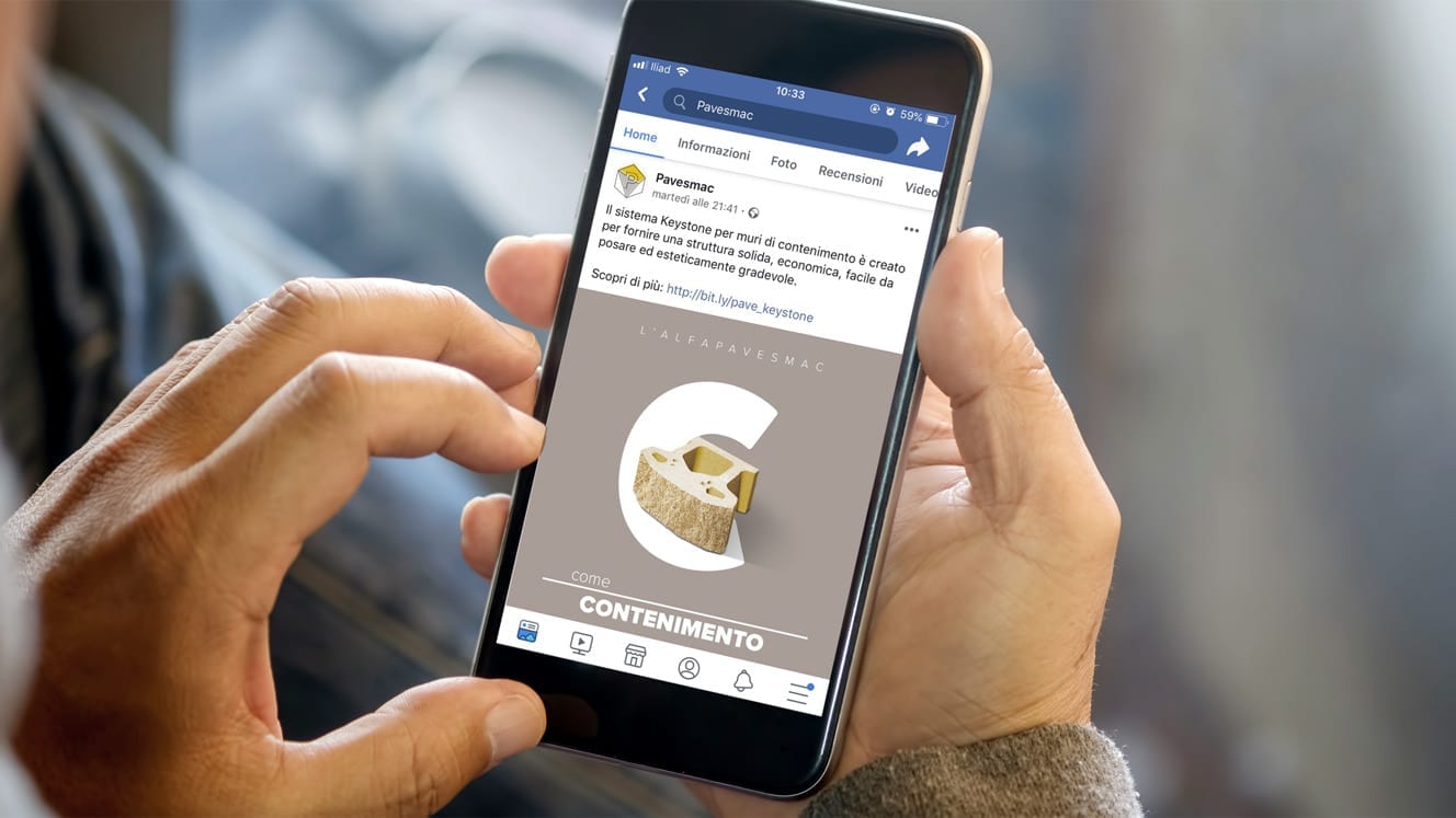
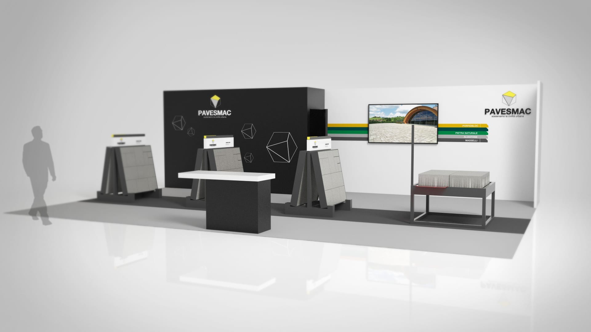
The company’s rebranding process involved press campaigns, the entire range of the products’ catalogues and social media channels.
